

A crest with history
A crest with history
The Athletic Club crest has undergone many changes throughout history. We take a look at the various versions that have been used
There are aspects of Athletic, being a club that protects its traditions like few others, that do not seem to have changed since the distant date of its foundation, back in 1898. However, more than 100 years of footballing history go a long way, and there are few elements that have not changed to a greater or lesser degree.
One of these elements, and one of great symbolic value, is the Club’s official crest. It is fair to say that there have not been many official Athletic emblems throughout its history, but that does not mean that their transformation has not been significant. These lines are a brief review of the evolution of the Athletic crest from its first appearance to the present day.
Athletic’s first official crest is documented as early as 1902. The journalist of the era José María Mateos, referring to it, stated: “In the middle of the blue and white, there’s a ball with the letters A and C intertwined in its centre.”
This reference is confirmed by the few traces preserved from those years: headings of official letters, membership cards and even the players’ own shirts, such as the one worn by Juan Mosser in the match against Burdigala of Bordeaux in 1903.
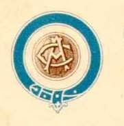
The original Athletic crest. Year 1902.
It is reasonable to assume that this logo remained in place until 1910, when the original blue and white shirt was changed to the now traditional red and white stripes. It was probably this change of kit that brought about one the biggest changes in the club’s history. Because, of course, crest and kit have always been closely linked, reflecting the same colours.
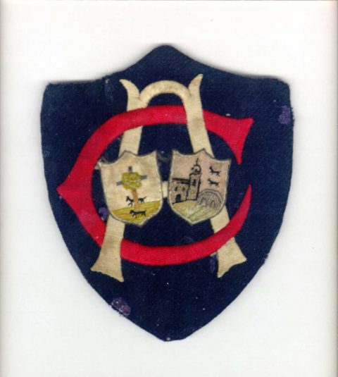
It was in the 1912-13 season when the colour red appeared in Athletic’s emblem for the first time. From this moment on, it could be seen on membership cards, press passes and other official papers, becoming a distinctive part of the Club. As a new element, the flag was included and the old letters, AC for Athletic Club, were kept.
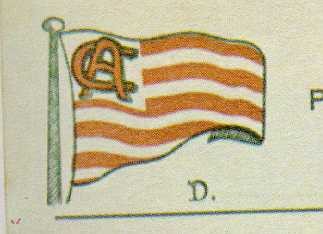
Letter header used in 1913.
At the same time, a “new crest” appeared. The aforementioned red and white flag with the letters A and C was still present, but a ball was also added and the border remained blue with yellow stars. It was a transitional logo that brought together the past of a club, still young as a football team, with the innovation and incorporation of the deeply traditional colours of Bilbao. The success of this particular emblem can be seen it its enduring usage, as it remains present around the Club to this day.
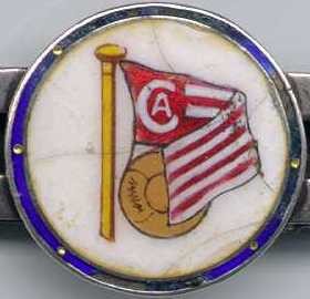
Badge used at the beginning of the 1910s.
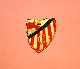
These were years of uncertainty regarding the badge that best symbolised Athletic. In addition to the two already mentioned, we must include the one worn by the team at San Mamés’ inauguration on 21 August 1913. For such a historic day, Athletic unveiled a new crest, preserved today by the family of Athletic’s goalkeeper during match, the endearing Cecilio Ibarreche. It consisted of the classic intertwined A and C along with the insignias of Bilbao and Biscay
Badge worn by goalkeeper Ibarreche at San Mamés’ inauguration on 21 August 1913.
The crest’s evolution took a new step forward at the end of 1910s, and its design became the immediate predecessor of today’s official crest. The original blue and the A and C of 1902 were maintained. It also incorporated the distinctive symbols of the town and province it represented. Also worn at the stadium’s first match, it features the bridge of San Antón and the wolves of the house of Lope de Haro with the tree of Gernika. The main change is the first appearance of the shirt’s vertical stripes. It should be noted that this crest is practically the same as the current one used by Atlético de Madrid, formerly known as Athletic Club de Madrid and at that time a branch of the Bilbao-based team.
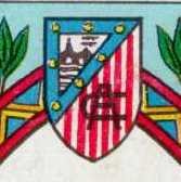
Crest that appeared in a collection of stickers from the 1922/23 season.
Embroidered badge from the jersey of Chomin Acedo.
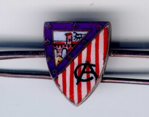
Tie pin from the late 1910s early 1920s.
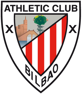
As was mentioned previously, Athletic’s next crest is one that’s still in use today, the first documented evidence of which dates back to 1922. As for this crest, one which is known by all, the name of the club and the city were added, and its shape was slightly changed by widening it on the sides.
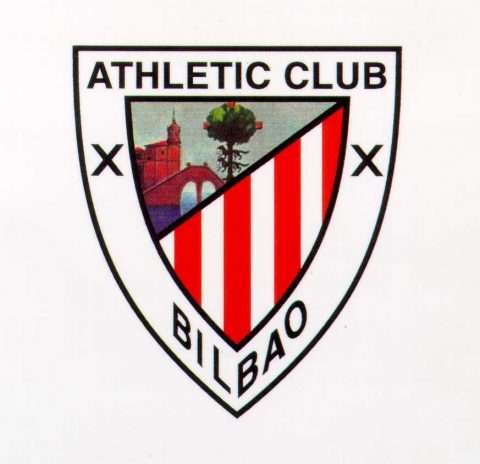
Official Athletic crest.
This badge was in force from at least 1922 to 1941, and then from 1972 to the present day. Between 1941 and 1972, during the Franco regime, and after the passing of a law declaring that only Castillian Spanish names could be used, the name of the club was changed from Athletic Club to Atlético de Bilbao. As a result, the crest underwent a small change, with Athletic being replaced by the government-enforced name of Atlético. The name Atlético de Bilbao remained in place from 1 February 1941 to 26 July 1972.
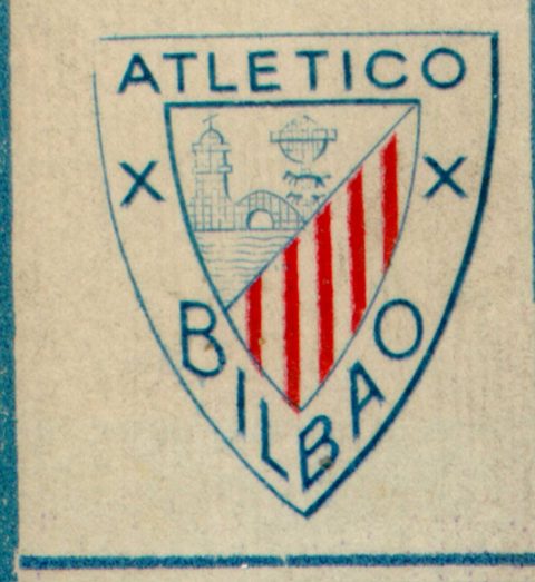
Official Athletic crest from 1941 to 1972.
With the name Athletic Club being restored, the crest reverted back to to the same format as in the 1920s. The design is now 100 years old. It is an emblem for the Club, but apart from that it is also part of the city’s collective subconscious.
*Updated version of the article published by Asier Arrate, director of the AC Museum, in the official Athletic Club magazine on 28 December 2000.