

The history of Athletic Club’s red-and-white striped shirt
The history of Athletic Club’s red-and-white striped shirt
We go on a journey through Athletic Club’s classic red-and-white striped shirt, from 1910 until the modern day
For most of Athletic’s history, the classic red-and-white home shirt has simply been red-and-white vertical stripes without many other changes in terms of the design’s minor aspects.
However, in recent decades, different brands and designers have played with the details in order to create more distinctive jerseys. In this article, we go on a historical tour of the shirt’s design, looking at those smaller, sometimes unseen, features.
The stripes
The classic vertical stripes have changed often throughout history, whether it be the width of the stripes, if there is even or odd number, or whether the central stripe is red or white.
Furthermore, although the white has few nuances, the range of reds, from the most intense and vivid to those close to maroon, has been a distinctive mark, especially in recent years.
The collar
The type of collar is an important aspect because, although it is no more than a finishing touch to the upper part of the jersey, it often makes a strip stand out compared to its predecessors. Essentially there are three different types: buttoned, round and v-neck.
Shirt or polo
Although shirts, with collars, open or half-open and buttoned, have been out of fashion in football for decades, it was the dominant style until the 1960s. From the 1970s onwards, polos and t-shirts became the standard fashion.
Pockets, cuffs, bibs, crest, logo, sponsors and other details
From the 1930s until the 1960s, breast pockets were common on the left side. The cuffs on long-sleeved shirts changed along with the pockets. The more the home kit resembled a shirt, the more likely it was to have pockets and button cuffs.
Shirt numbers officially became part of the kit in 1948. For decades, until shirts became personalised in 1995-96, the numbers typically reflected a position on the pitch.
1974-75 was the first season in which the crest appeared on Athletic’s home kit. Previously, in the first old shirts, especially the classic half-blue half-white ones, some crests were sewn onto the chest, but they disappeared from 1913 onwards.
Since the 1981-82 season, the kit has featured the logo of the Club’s official kit suppliers. It first appeared on the goalkeeper’s kit and then on the outfield players’ shirts. The famous Adidas symbol ushered in a new era marked by the growing commercialisation of sportswear.
The 2008-09 season was the first in which the Lions had sponsored advertising on its kit, with Petronor being the first shirt sponsor.
Since the 2015-16 season, Kutxabank has been the Club’s shirt sponsor. In the 2004-05 season and in the UEFA Cup, Euskadi was promoted on the shirt, but as it was institutional and not commercial, it was not considered advertising per se.
Manufacturing: from local tailors to New Balance
There is a big difference between shirts which were designed and manufactured solely for the use of football players, and those shirts which, in addition to their professional sporting use, were also designed with a manufacturer’s brand name for subsequent public marketing.
This concept has consequences for both design and manufacturing. A local tailor or textile factory making 100 pieces of clothing from the same red and white fabric, as was the case until the 1970s, is not the same as a multinational company that aims to sell thousands of shirts in all possible sizes and in very different markets.
When it came to domestic retail production, we could work out the number of tops needed from the same piece red and white fabric, conditioning both the number of stripes and other aspects, such as collars, cuffs and pockets.
The same starting XI could wear shirts with different coloured central stripes and nobody cared. The same thing happened with the pockets. As they were sewn on from scraps of the same fabric, they alternated between red and white depending on the piece of fabric used. The collars could also be any combination of red and white.
Stocks: used for several seasons in a row
Until the 1980s, the same shirt could be used for several seasons in a row or recycled for reserve teams. At the end of each season, the Club took stock of the number of kits available and, depending on the quantity, new items were purchased.
Four major periods
In the light of the above, we can divide the historical design of the red-and-white shirt into four main periods:
- 1911-1920 Diversity.
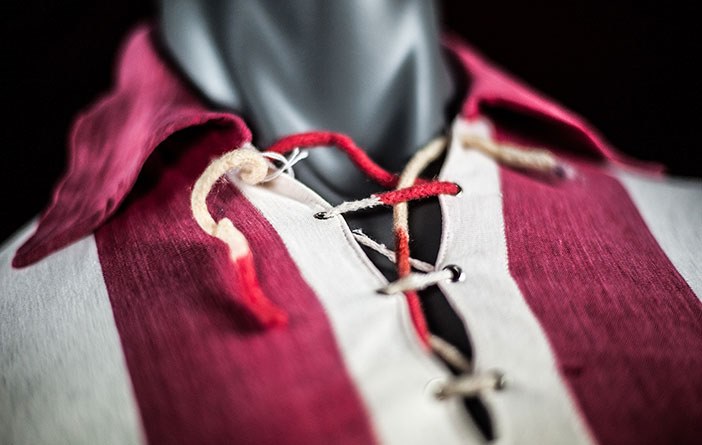
In truth, until the 1920s, the Lions’ kit had no regular patterns. The shirts were indeed red and white, but apart from that each one was its own species. Some had shirt collars, while others had v-necks with laces, and the players who wore them would pose for the same group photo as normal.
Their origin is also unknown, although there is no doubt that Juan Elorduy brought the first kits over from the United Kingdom, leading to the change from blue and white to red and white.
- 1920-1970 From the shirt to the polo.
For 50 years, a shirt-like design was used, it was characterised by the use of collars and a central opening with buttons. The evolution is similar to the evolution which took place in the fashion world, moving from the shirt towards the polo.
The central opening gradually closed, and in 1967 the buttons disappear entirely, but the collars and the v-shaped fastening are maintained. These kits were ordered from local factories or tailors, who were responsible for minor design details, such as the colour of the central stripe and the number of stripes.
Until 1959, the number of stripes alternated between nine and 11, and the central stripe was predominantly white. From 1959, the number of stripes was reduced to seven on average (this remains the case depending on size).
- 1970-1980 Towards a more sporty and commercial design.
In the 1970-71 season, Athletic Club abandoned collars and for the first time wore a round-necked shirt.
It was the first step towards a modern design. From the 1980s onwards, international brands dedicated to exclusively manufacturing sportswear dominated the industry.
Short sleeves, comfortable fabrics, personalised designs… In fact, during the 1970s, Athletic kits were no longer ordered from local factories and were bought directly from the international supplier, specifically Adidas.
- 1981 – Present day. The rise of sports brands.
In the 1981-82 season, Athletic Club’s jerseys were the first to bear the Adidas logo. It was the beginning of a new era.
Nowadays, brands pay to supply kits to teams and make their profits through the massive sales of items among fans and collectors.
To this end, every year a new design is launched (at Athletic since 2007), including home, away and alternate kits. As well as that, there are exclusive designs for the different competitions or special matches.
Since 2017, our kits have been supplied by New Balance. Athletic has seen further modernisation in its jersey, with the incorporation of distinctive touches meant to reinforce our unique identity.
We have worn the shirts during the last four years, in the Copa finals and in the Super Cup triumph, and will continue to wear them in all our successes until 2022-23 at least.